 |


Have you ever painted a picture of a character you were proud of, and when you added a background, you kind of "ruined" the picture, because it didn't quite fit together? I'll teach you a simple trick how to choose the colors so the characters fit the background, but they still keep their natural colors. |
|
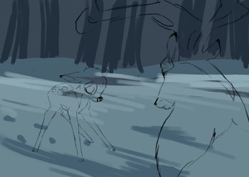
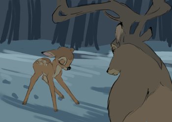
Let's take this picture of Bambi and his father as an example. Please make sure to remember this: When you want everything in the picture to fit together, you have to paint the background first. It's almost impossible to add a good-looking and fitting background to a character you've already finished, or at least it's very hard to do.
Another important thing is to think about the whole picture before you start painting. You have to know wheather you want a bright colors showing scene lit by a strong sunlight, a scene right in the center of burning flames etc. I wanted the colors to be like in the movie scene - showing dark, snowy weather, without much contrast to express the depressive feeling. I helped myself by copying the colors right from the screenshots and I sketched the background.
|
|
|
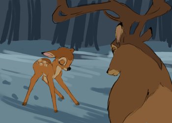
Now when I have the background, I need to fill in the colors of both characters (into separate layers). I looked at some cliparts of Bambi and Prince and copied their "basic colors". You can do the same when you're coloring original characters. If you're making a character of your own, it's the easiest way to think up the most basic colors that fit your character the best. Forget about the background at this point.
|
|
|
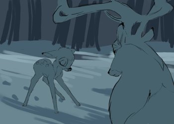
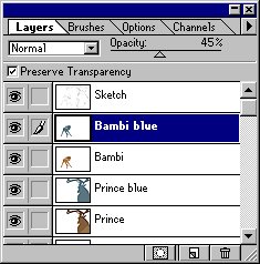
Now take a color from the background. Choose a bright one or a dark one depending how much light goes on your characters, and fill in the colors to a layer above the basic colors. I named the layers "Bambi blue" and "Prince blue" because I have both characters in separate layers.
|
|
|
At this point, all you have to do is to set up transparency for the "Bambi blue" and "Prince blue" layers. Because you have the real basic colors under the blue-colored layers, you'll get colors that correspond your characters, but still fit into the background. I set up the transparency to a 45% opacity. You'll loose some contrast by doing this, but it doesn't matter, because you can add the contrast later by putting shadows and highlights to your characters.
|
|
|
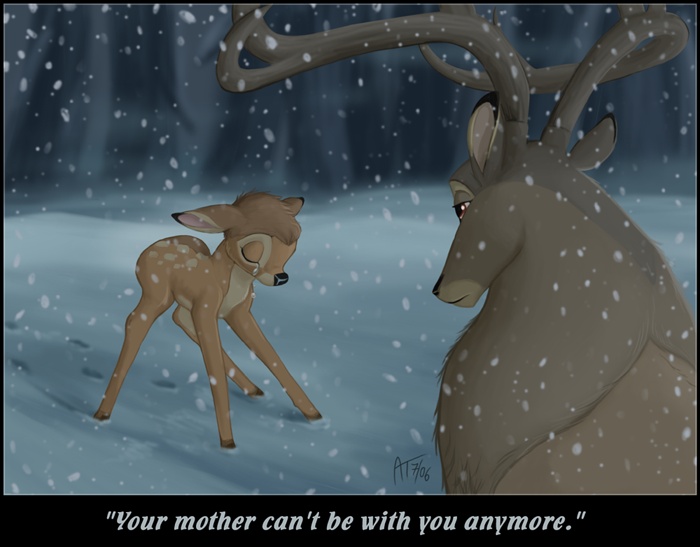
You're done! Now just merge both color layers (Bambi + Bambi blue in my case) by selecting Layer --> Merge down (Ctrl + E) and you have the basic colors in your image. Now you're ready to add details :) The finished picture is here.
|
 |
 |
All of the images and graphics have been made by me (Akela Taka). Please do not copy, use or redistribute them without my permission. Copyright © 2002 - 2010 Akela Taka. All copyrighted characters belong to their respective owners. |
|


